Interior Design Stories
Browse all current and past decorating ideas from Beautiful Windows Blinds.
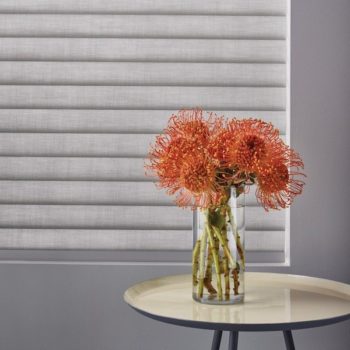
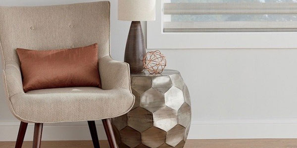
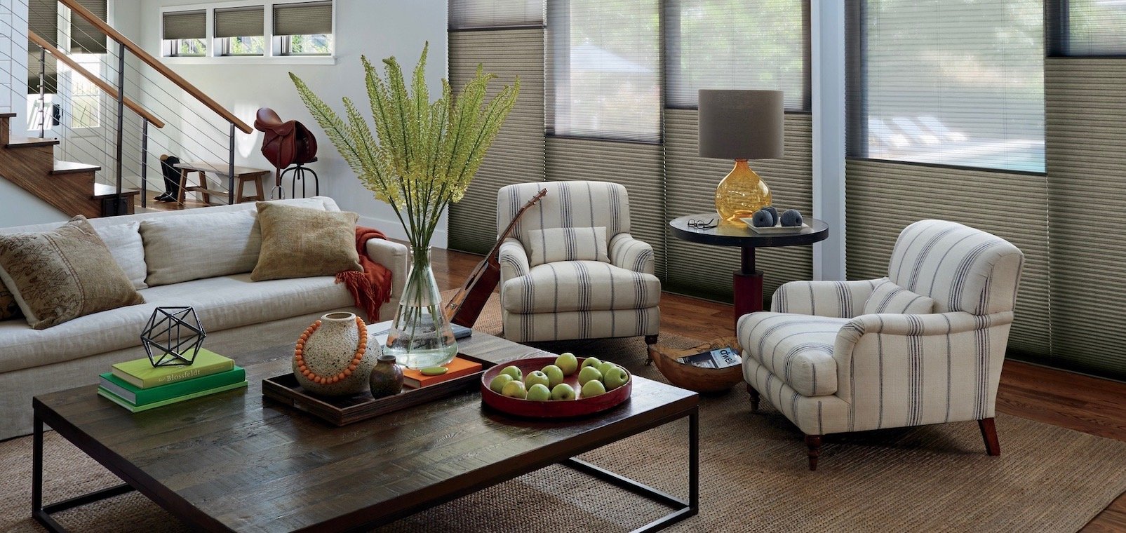
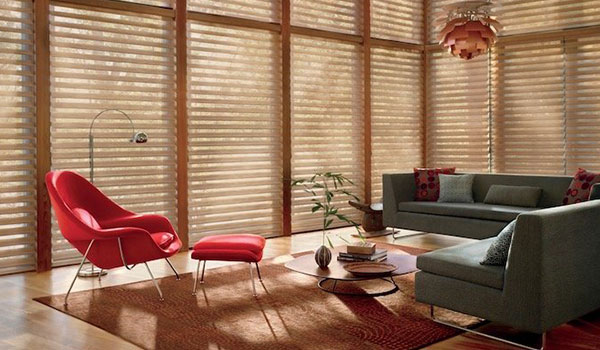
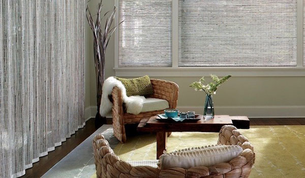
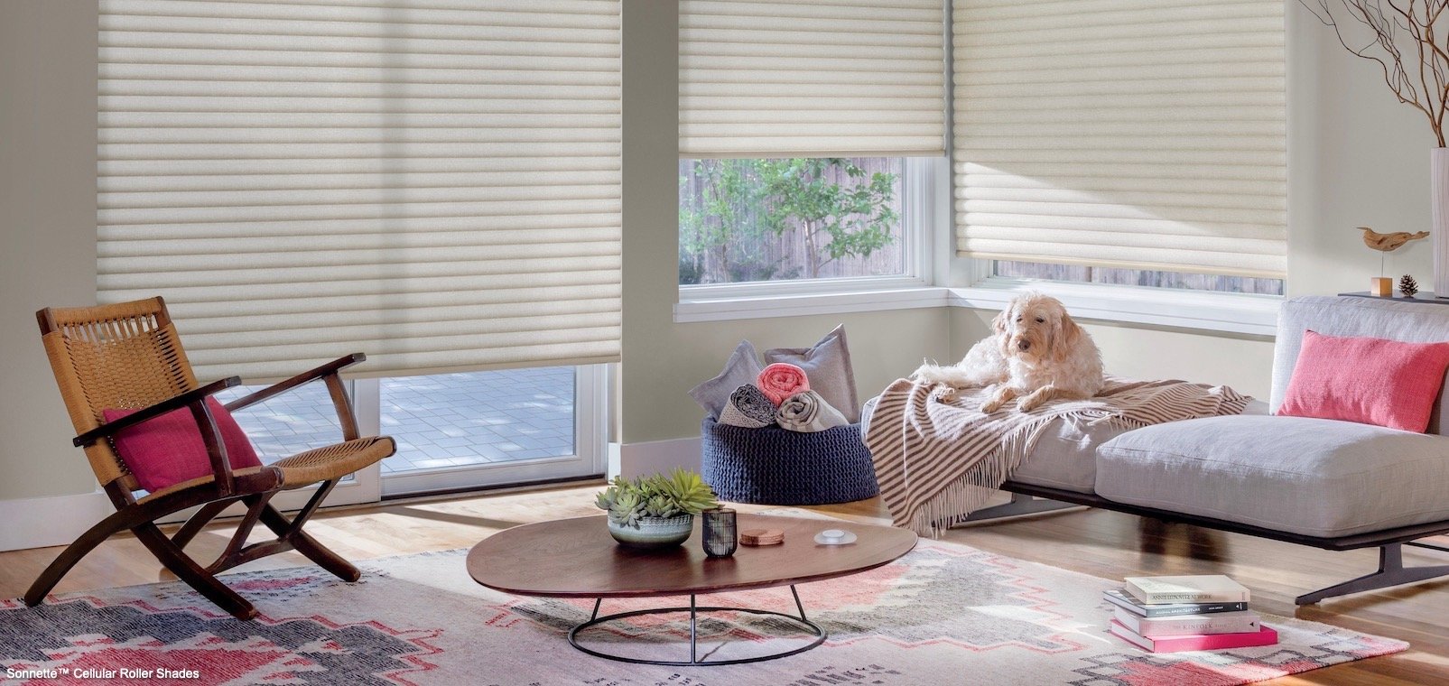
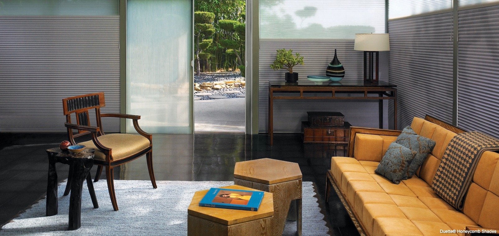
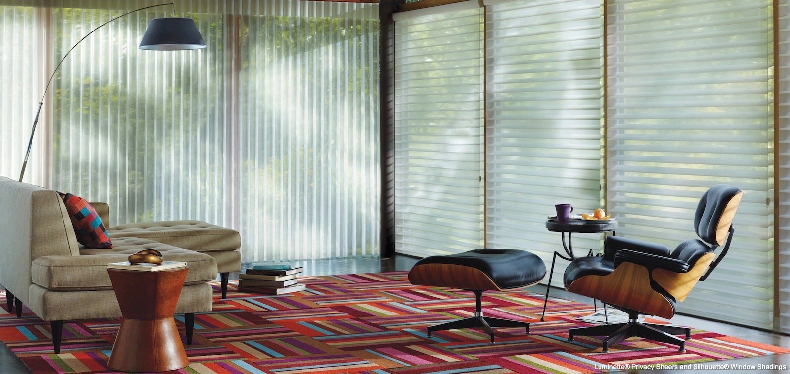
Side Tables
FOCUS ON YOUR SIDE TABLES
A side table – also called an end table or accent table – is different than a coffee table, which tends to be in front of your sofa and easy chairs. Because side tables sit alongside chairs or sofas, or against a wall, they’re often overlooked in planning your décor, yet they’re the perfect place to add an unusual or dramatic piece.
A side table can be an attention getter, without making such a big statement that it totally defines your space.
ATTENTION-GETTING PIECES
When shopping for an attention-getting side table, think:
– Asian painted pieces
– Turkish or Moroccan inlaid wood tables
– Recycled wood pieces
– Metallic pieces in a matte, shiny or distressed finish
– Clear bold lucite tables
Or you can transform an existing side table by painting it a dramatic color, refinishing it with a faux finish or topping it with a beautiful piece of glass, marble, granite or mirror. Just make sure the design is in scale with your existing furnishings and complements your décor.
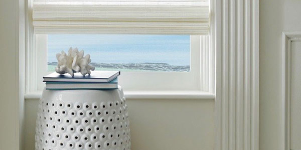
WHAT TO DISPLAY
Side tables are perfect for displaying decorative objects, but don’t add too many objects or you’ll create clutter. Think about displaying items such as:
– A small sculpture or object
– Books
– A floral arrangement or plant
– A vase
– A lamp
– A photograph of family, friends or a favorite destination
– Candles
– A clock
Take a look at your living room or great room from a different angle, and focus on side tables this season.
Decorating with Greige
GREIGE - A NEW AND DIFFERENT NEUTRAL
Can’t decide between gray and beige? Maybe you don’t have to, now that greige is the trending neutral in interior design.
Greige is really hard to describe because it’s so similar to some shades of gray and to some shades of beige. It’s really an in-between color, so it’s hard to define where greige begins and ends on the neutral color continuum. Even the name greige is a combination of the words grey and beige! It’s pronounced like beige but with a “gr” sound at the beginning.
GREIGE TIES YOUR COLOR SCHEME TOGETHER
One thing is certain. Greige is a pleasing and flexible neutral for home design elements that goes with most any palette. The color extends from quite dark tones, almost charcoal in look, to the lightest taupe hues and from cooler to warmer shades, depending on the ratio of gray to beige in the mix.
Greige ties together other neutrals, such as white, cream, tan, black and grey tones. This fabulous color also plays well with splashes of both bold and subtle hues, allowing other colors to pop. Because of its soft, neutral tone, greige brings disparate colors into a harmonious whole.
WHERE TO USE GREIGE
This soothing color works well in just about every room and for almost any surface, including:
– Soft upholstery fabrics and rugs
– Hard flooring surfaces, like tile and stone
– Counter surfaces, including granite, quartz, marble and laminate
– Wall surfaces, such as paint and wall coverings
– Bed and table linens
Add versatile greige to your color palette this season!
Floral Patterns
MAKE YOUR INTERIOR BLOOM
Adding floral patterns to your décor can bring brightness and joy into your home. Traditional choices include chintz and botanical prints, but contemporary designs are available too, including abstract patterns that sometimes barely look like leaves or flower petals. Many of today’s floral designs are totally up to date with current color palettes and decorating styles.
Depending what prints you choose, florals can create a feminine and delicate mood or make a bold statement.
FLORALS MIX WELL WITH OTHER PATTERNS
Surprisingly, florals go well with other patterns such as stripes, plaids and checks. They also pair well with solids in complementary colors. You can even combine small-scale and large-scale floral patterns with common colors in each design to ensure a harmonious result.
Think about using floral prints for:
– Wall coverings
– Carpeting and rugs
– Upholstery fabrics
– Window treatments
– Painted patterns on wood furniture and walls
YOU CAN START SMALL
If you’re nervous about adding florals to your home décor, remember that just a small addition of a floral print can lighten up an entire room. Experiment just a little with:
– Decorative throws
– Pillows
– Bedding
– Table linens
– Floral decor
Bring spring indoors this season by adding floral prints to your décor. They’ll refresh your home environment with a bright, natural look.
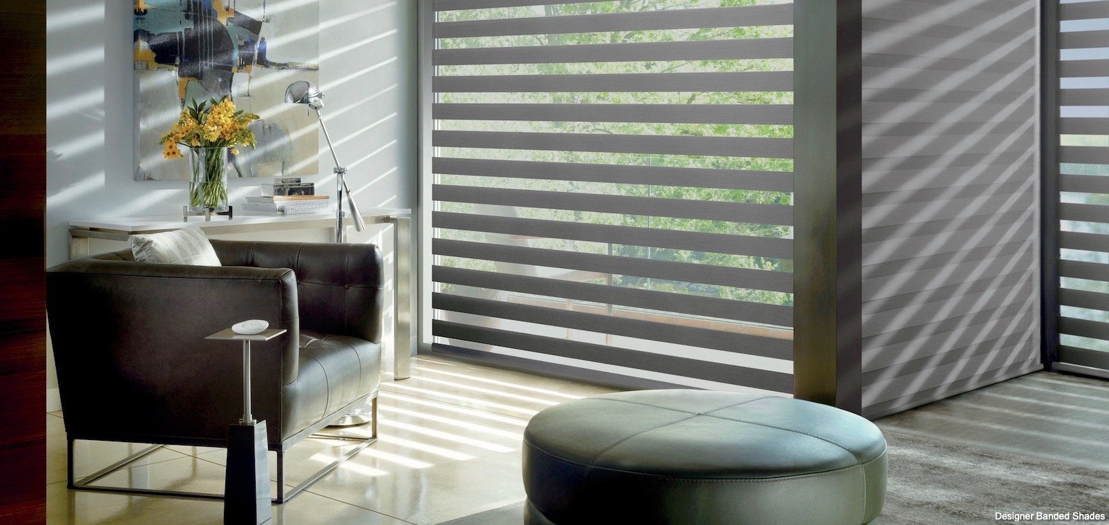
Decorating with Stripes
STRIPES ARE VERSATILE
Adding stripes to your décor is the perfect finishing touch – very similar to adding beautiful ribbons to your gift packages! Stripes complete and dress up almost any decorating plan.
Stripes are a versatile design element and go well with any décor, including contemporary, traditional, Victorian, transitional, shabby chic and mid-century. It all depends on the striped elements you select and how you use them.
STRIPES ADD ORDER TO A ROOM
Stripes can liven a room and make it look crisp and organized. Traditional vertical stripes make a room appear taller, while horizontal stripes can make a room appear larger. If you’re bold, you can even go diagonal!
Stripes can be wide or narrow – or not the same width throughout. They can have clean edges or be jagged and funky. Stripes can even be made out of various objects, such as small flowers or geometric shapes. Straight-edged stripes are a good place to start if you’re afraid of the busyness of patterns.
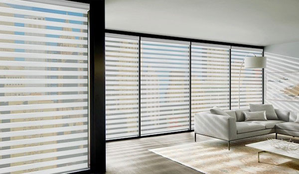
WHERE TO USE STRIPES
If you’re nervous about adding any patterns to your décor, gain confidence by starting small with stripes: Add elements such as striped bed linens, throw pillows, lampshades, vases or rugs.
If you feel bolder, think about trying stripes in upholstery furniture, wall coverings, carpeting, window treatments and more.
Create a new pattern in your life this season by adding stripes to your home décor.
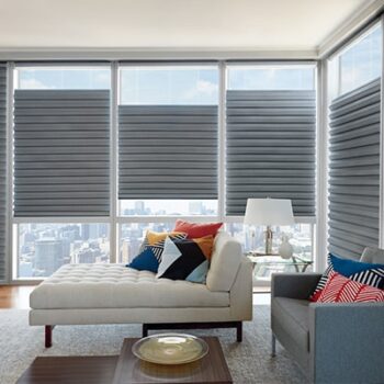
Deep Blue Accents
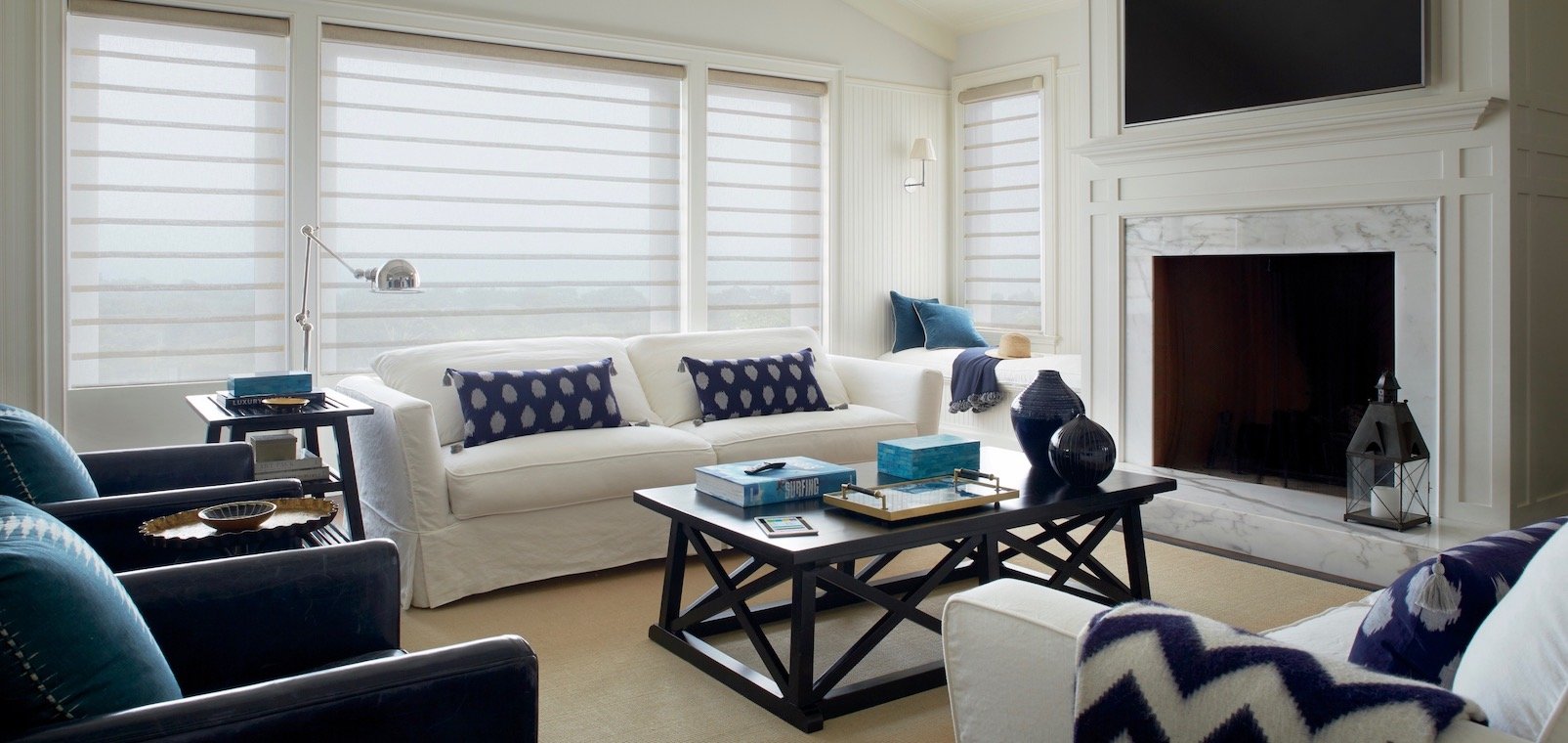
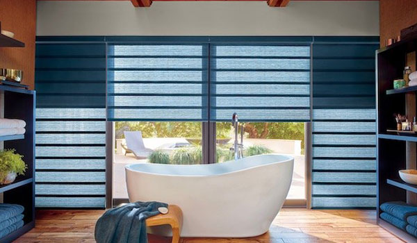
Deep blue window treatments create a calm feel in this bathroom.
CREATE A FEELING OF POSITIVITY
Deep blue, similar to the color of the night sky or a beautiful sea, suggests a mood of calm and harmony. This beautiful color comes with several names and nuances, including: Cobalt, Royal Blue, Navy, Indigo, Lapis, Mediterranean Blue and Midnight Blue.
Deep blue complements almost any design plan, from the most modern look to Asian décor to traditional and Victorian styles.
CONSIDER THESE COLOR COMBINATIONS
Deep blue works as a beautiful accent with neutrals such as grey, ivory, white and beige, and it even pairs well with lighter shades of blue. On the cool side of the color spectrum, deep blue is beautiful when combined with periwinkle, lavender and pink.
Deep blue can also help to bring attention to other colors in a room, especially complementary warm hues, such as copper, rust, tangerine, lemon, and ochre.
Deep blue pairs well with neutrals, such as white, and also with complementary warm tones, such as copper.
Combining a deep blue striped rug and patterned pillows with white furnishings creates a summery theme.
WHERE TO USE DEEP BLUE ACCENTS
Consider using a deep blue tone in the following ways:
– In striped, plaid or gingham patterns
– For a dramatic accent wall in your powder room or foyer
– Paired with soft and gauzy white fabrics for a summer décor
– To create a nautical or beachy theme
– To build an Asian look with ceramic stools, lamps and vases
– To invent a Moroccan style with patterned tile, fabrics and rugs
Create peacefulness in your interior plan this year by adding a touch of deep blue.
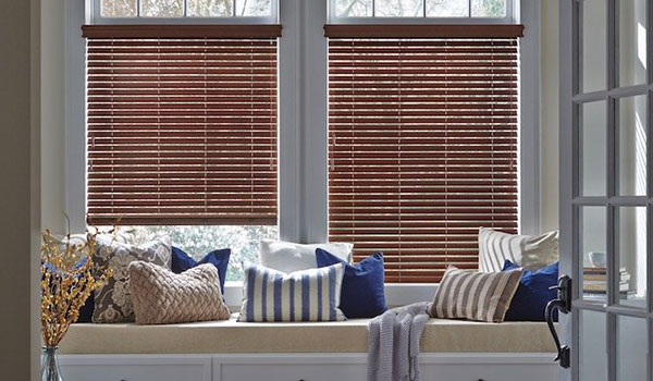
Easy Chairs
Life just seems more relaxing once you’re settled in an easy chair!
EXPAND YOUR LOUNGING OPTIONS
The word “easy” in “easy chair” is just about the only description you need to understand the appeal of this comfy and cozy piece of furniture. In the stressful and busy lives most of us live, an easy chair is so important to lend spontaneity and comfort to a home.
You and your guests will gravitate toward an easy chair, and life just seems more relaxing and cozy once you’re settled in! That’s why so many people keep their easy chairs for way too long, even when they’re ragged, with split fabric, duct tape, and even sprung springs. Take a look and see if this applies to you. It may be long overdue for you to replace your easy chair or at least have it rebuilt and reupholstered.
FUNCTIONALITY COMES FIRST
Since the purpose of an easy chair is relaxation and comfort, it makes sense that choosing an easy chair is about functionality first.
Pick a chair that is comfy and deep, but not so deep that it swallows you. Also, make sure it’s not too big to fit into your room.
Think about what you plan to use the chair most for – reading, having a conversation or watching TV. Then make sure to test chairs when you shop.
Pick a chair that is comfy, but not so deep that it swallows you.
Easy chairs are a good place to add a bold color to your décor.
STYLE IS IMPORTANT, TOO
Consider how a new chair will look and fit with your other furnishings. An easy chair may be the perfect place to add a bold new color, texture or pattern to a room. You can even use slipcovers to create a different look for various times of the year!
Many people love leather for easy chairs because of its supple feel and durability. Consider other easy-to-clean and long-wearing fabrics that are also comfortable and soft.
Life seems so much more effortless and enjoyable when you’re lounging in an easy chair. Add one to your home this year!
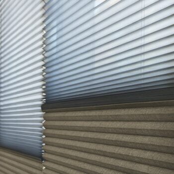
Adding Texture
TRANSFORM YOUR HOME WITH TEXTURE
The look of your interior design is mostly about the sense of sight, maximizing the visual beauty of your home. But adding texture to the equation brings in the sense of touch.
Having a variety of textures in a room adds interest and emotion, provides balance, and may enhance your physical comfort for sitting and lounging.
A room without much texture can be quietly beautiful, communicating sleekness and calm, but it can also become a bit monotonous.
CREATE INTERESTING CONTRASTS
Texture adds a tactile sense to your interior design and wakes up the room. Soft and silky finishes can relax your senses, while rougher textures will energize you.
Think of these contrasts when selecting finishes for a room:
– Thick and thin
– Soft and hard
– Bumpy and smooth
– Silky and rough
– Flexible and stiff
CONSIDER THESE DESIGN ELEMENTS
Ideas for adding texture are:
– A natural contoured edge for a wood table or counter top
– Textured woven wood shades
– Natural furniture made of rattan or wicker
– Rugged fabrics such as tweed, tapestry and some wools
– Ridges or embossed patterns in wall coverings
– Distressed or faux paint and stain finishes
– Knotty or unfinished wood
– Shaggy or contoured carpeting and rugs
– Tufted upholstery or even ruffles
– Rough finishes on stone floors or backsplashes
Add tactile texture to your interior plan! It will transform the feeling of your home.
Upgrade Your Ceiling
TAKE YOUR DÉCOR TO NEW HEIGHTS
Most of the time, we think about ceilings as just a blank place at the top of our walls. Instead, think of ceilings as a fifth wall that can be enhanced to add character and beauty or make your rooms seem more spacious.
Some changes involve major structural renovations, such as:
– Warm wood beams
– Rustic wood slats
– Vaulted ceilings
– Raising the roof to add a row of windows
– Cutting through the roof to install skylights
For these dramatic changes, you’ll need to hire a contractor (and maybe even an engineer) to advise you and do the work, keeping in mind structural issues in your home.
MORE IDEAS FOR THE CEILING
Other ceiling enhancements are easier to complete such as:
– Crown molding on or near the ceiling
– Coffered ceilings
– Coved ceilings
– Hollow beams that don’t add weight to your home’s structure
– Contrasting paint color, either darker or lighter than wall paint
– Stencils or murals
– Faux paint finishes
Take your home environment to a higher level – and don’t forget about the ceilings!
Decorating with Pink
ADD THE COLOR OF HAPPINESS TO YOUR HOME
Pink connotes romance, so it’s perfect to add this shade during Valentine’s Day month. It’s also an excellent choice year round, because pink has been called the color of happiness.
Traditionally, pink is a frilly and girly color, but it doesn’t have to be. Depending on the hues you select, it can be modern, sophisticated and luxurious.
You can create most any mood depending on which shade of pink you select, including these delicious hues: watermelon, pink grapefruit, shrimp, strawberry, bubble gum, cotton candy and raspberry.
SET THE MOOD WITH YOUR FAVORITE SHADE OF PINK
The more vibrant shades of pink add energy and excitement to your décor, while softer shades create a feeling of calm and tranquility.
Pink and green are almost opposites on the color wheel, which is why pink looks fabulous with many green hues including tasty mint, dusty sage, brilliant emerald, zesty lime, and even acid green.
Pink also works well with white, grey, black, gold, silver, brown and red, based on the shade of pink you select.
IDEAS FOR ADDING JUST A TOUCH OF PINK
Are you nervous about making a big investment in pink? In small amounts, think about adding pink for:
– Bed linens
– Throw blankets and pillows
– Accessories like candles, artwork, flowers and lamps
– Slipcovers
– Small rugs
– A painted accent wall
Move your decorating plan into the pink by adding this versatile color!
Ottomans
FIVE WAYS OTTOMANS ENHANCE A ROOM
Also called hassocks, footstools or footrests, ottomans have so many more uses that just resting your tired feet. They are perfect for living rooms, bedrooms, home offices and dens.
Ottomans provide:
– A place to set a tray of drinks or a plate of cookies
– Extra seating when you have guests
– A convenient surface for playing a game of chess or checkers
– A seating area to put on shoes and socks
– Some provide extra storage inside
OTTOMANS ADD FLEXIBILITY, STYLE AND FUNCTION.
Ottomans are super flexible because they can be moved around a room, against a wall or under a table.
They come in all shapes, sizes, fabrics and styles to complement any décor and any size constraints.
In addition to the typical square or rectangular shape, think oval or round.
You can use a fabric that matches your bedding or furniture to make the ottoman blend in – or choose fabric that contrasts to add an engaging accent.
WANT TO CREATE A SCENE?
Consider an unexpected color or bold print to call attention to this flexible piece of furniture. Or drape a scarf, pashmina or throw over an ottoman to add drama.
If you’re worried about dirt from people’s feet or staining from spills, you can even slipcover your ottoman.
This season, add an ottoman to your interior. Then start thinking about all the ways you can use it!
Vintage Pieces
A VINTAGE PIECE ADDS PERSONALITY TO A ROOM.
Are you feeling afraid to add an antique to your modern decorating style? Relax! A vintage piece complements almost any décor and adds your own personality to a room.
Sometimes we envision antiques as being overly formal and hundreds of years old. But many antiques are much newer and more relaxed in style. In addition to Victorian furniture and even older, more traditional pieces, think:
– Sleek mid-century modern pieces
– Art Deco pieces from the early 20th century
– Casual American pieces from the 19th century and earlier
VINTAGE ITEMS CAN BRING BACK GOOD MEMORIES.
You can purchase antiques from a variety of sources. Best of all is using a piece you’ve inherited from a dear friend or family member because of the memories of that cherished person. It’s also fun to pick up an antique when you go on a vacation, because these pieces bring back good remembrances, too.
Some delicate antiques need tender loving care, while others are solidly constructed and may be already distressed, with surfaces that are painted, stained or unfinished, so there are no worries about spills and dents. Someone else has already broken them in for you!
A TOUCH OF THE OLD MAKES YOUR DÉCOR LOOK NEW.
When you think about adding a vintage piece, think beyond just furniture such as chairs, end tables, dining tables, Bombay chests and desks.
Think also about beautiful vintage accessories, including:
– Lamps
– Mirrors
– Rugs
– Posters, and
– Knick-knacks.
Don’t be nervous about mixing a vintage piece with your modern décor. A touch of the old will refresh your look!
Decorating with Black
ADDING JUST A BIT OF BLACK
Adding a touch of black is a design necessity for almost every room. There’s something about this dark and mysterious shade that enhances other colors and moors a room. Even if it’s a small touch that you and your guests hardly notice, a pinch of black does make a difference.
One of the best things about black is that, unlike other colors, it never goes out of style!
WHERE TO ADD BLACK ACCENTS
Ideas for a dab of black include:
– Wrought iron bed frames or stair railings
– Upholstery fabric or leather
– Flooring
– Painted walls or wall coverings
– Lamps or lampshades
– The inside surfaces of a built-in shelving system
– Picture frames
– Black and white photos or paintings
– Granite or marble countertops in the bath or kitchen
A LITTLE BIT GOES A LONG WAY
Black can add drama, sophistication, austerity or masculinity. Do keep in mind that black is a strong color, so just a little goes a long way.
Some people are bold enough to decorate with black as the main hue in their design plan, but do be cautious: Too much black can be overpowering.
Think about combining black with other colors, because it goes well with almost all shades, especially white and cream. Black also looks beautiful with soft pastels and bold jewel tones.
Add a dash of black to your rooms this season to anchor your design style.
